Branding Overview
Design your identity experience. Ship it instantly.
No redeploys. No frontend rewrites. No friction.
Why Branding Exists
Most identity systems treat the login screen as an afterthought — a fixed, generic UI that every tenant shares. That creates friction: enterprise customers expect their logo, their colors, their voice. Integrators end up forking the UI or building custom wrappers just to match a brand.
Shyntr solves this differently. Branding is a first-class feature, not a workaround. Every tenant gets a fully isolated visual identity applied to login and consent screens — managed from the dashboard, activated instantly, with no code changes required.
Branding is resolved at request time. Change it in the dashboard, publish it, and the next user to open the login screen sees the updated design. No rebuild, no redeployment, no cache flush needed.
Core Capabilities
| Capability | What it means |
|---|---|
| Per-tenant branding | Every tenant has its own isolated token set |
| Token-based theming | Colors, typography, borders, and layout via JSON |
| Draft / Preview / Publish | Safe editing without touching production |
| Preview = production | The dashboard preview uses the same renderer as the live portal |
| No redeploy | Changes go live through the dashboard, not a deployment pipeline |
| Admin API support | Full programmatic control alongside the visual editor |
Tenant-Based Customization
Each tenant in Shyntr has its own branding configuration. Tokens are scoped to the tenant — one tenant's color palette never bleeds into another's login screen.
Tenant A and Tenant B can have entirely different login experiences on the same Shyntr instance. No shared state, no theming conflicts, no cross-tenant leakage.
Configurable token groups:
- Colors — primary accent, background, text, and border colors
- Typography — font family and semantic weight levels (
500/600only) - Borders — card and input border width (
0–10) and corner radius (0–32) - Widget — login title, subtitle, and logo URL (falls back to the Shyntr mascot if unset)
- Background — solid color or full-bleed image, with automatic color fallback
See Token Reference for the full schema, accepted values, and validation rules.
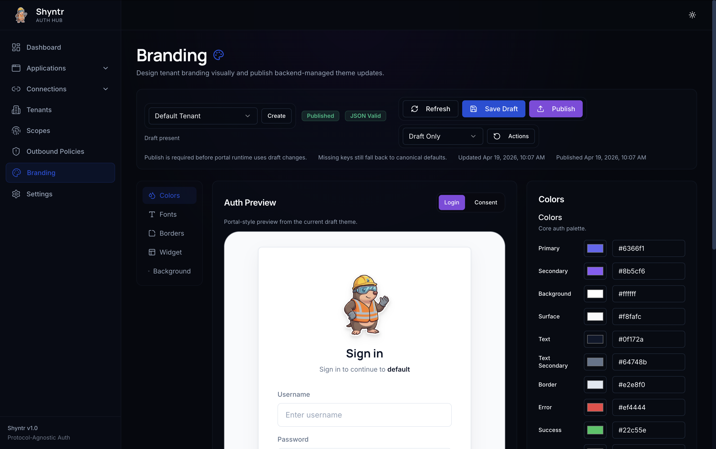
Draft → Preview → Publish Flow
Branding changes never go live automatically. Every edit is saved as a draft. You review it in the preview panel, then publish when you're satisfied.
Editing a draft does not touch the live portal. Only Publish activates changes for end users. If you need to roll back, reset to defaults or republish a previous configuration.
The lifecycle in one sentence: edit freely in draft, verify in preview, ship with publish.
Preview = Production
The dashboard preview is not an approximation. It uses the same token resolver and the same layout components as the live login and consent screens.
What you see in the preview is exactly what your users will see. Same renderer. Same components. No visual-only shortcuts. No hidden transformations.
This is structural, not a policy. Because both surfaces share the same rendering code, drift is not possible. A border width of 5 renders as 5px in preview and 5px in production. A font weight of 600 is 600 in both. No scaling, no remapping, no surprises.
See Preview = Runtime Parity for the full breakdown, including examples and a complete parity summary table.
No Frontend Dependency
Branding does not require frontend changes of any kind. You do not need to:
- Modify the login or consent UI
- Add CSS variables or theme overrides
- Rebuild or redeploy your auth portal
- Coordinate with a frontend team
Tokens are applied server-side at render time. The auth portal UI reads them on every request. Updating branding is purely an admin operation.
If you are running a fully custom login UI via the headless flow, token-based branding still applies to the consent screen and any Shyntr-rendered surfaces. Both paths use the same token resolution.
Dashboard Experience
The Shyntr dashboard includes a section-based visual branding editor:
- Live preview panel — updates in real time as you change tokens
- Section-based editing — colors, typography, borders, widget, and background are each their own collapsible section
- Tenant selector — switch between tenants without leaving the editor
- Draft status indicator — always shows whether the current draft differs from the published configuration
- One-click publish — activates the draft for the selected tenant immediately
No design tools required. Configure a full branded login experience directly in the dashboard.
Admin API Support
Every branding operation available in the dashboard is also available through the Admin API. This makes branding programmable for:
- Automated onboarding flows that provision new tenants with a default brand
- CI/CD pipelines that deploy branding alongside application configuration
- Multi-tenant SaaS platforms that manage branding programmatically per customer
The API accepts and returns the same JSON token structure shown in the Token Reference. Dashboard and API are always in sync — there is no separate schema.
How It Fits in the Flow
Branding is resolved as part of the standard authentication flow. When a user is redirected to the login or consent screen, Shyntr resolves the active published branding for that tenant and applies it before rendering.
User → Auth Flow → Shyntr resolves tenant → Loads published branding tokens → Renders login/consent
If no branding has been published for a tenant, Shyntr applies system defaults. There is no error state — the screens always render.
Identity UX as a First-Class Citizen
Most identity infrastructure treats UX as an integration concern — something the product team handles after the auth layer is wired up. Shyntr disagrees.
Identity touchpoints — login, consent, logout — are where trust is built or broken. A branded, familiar-looking login screen is not cosmetic. It is a signal to the user that they are in the right place. It is the difference between a professional product and a generic auth page.
Enterprise customers routinely require branded login experiences as a condition of deployment. Shyntr makes this a zero-effort capability, not a custom integration project.
Shyntr treats the login and consent UI as an owned product surface — configurable, versioned (draft/publish), and guaranteed to render consistently across every environment.
Next Steps
- Token Reference — every token group, accepted values, constraints, and fallback behavior
- Preview = Runtime Parity — how Shyntr eliminates visual drift between dashboard and production